WHWA Identity
Branding
How do we introduce a new vision of wellness without losing the familiar sense of trust built over generations?
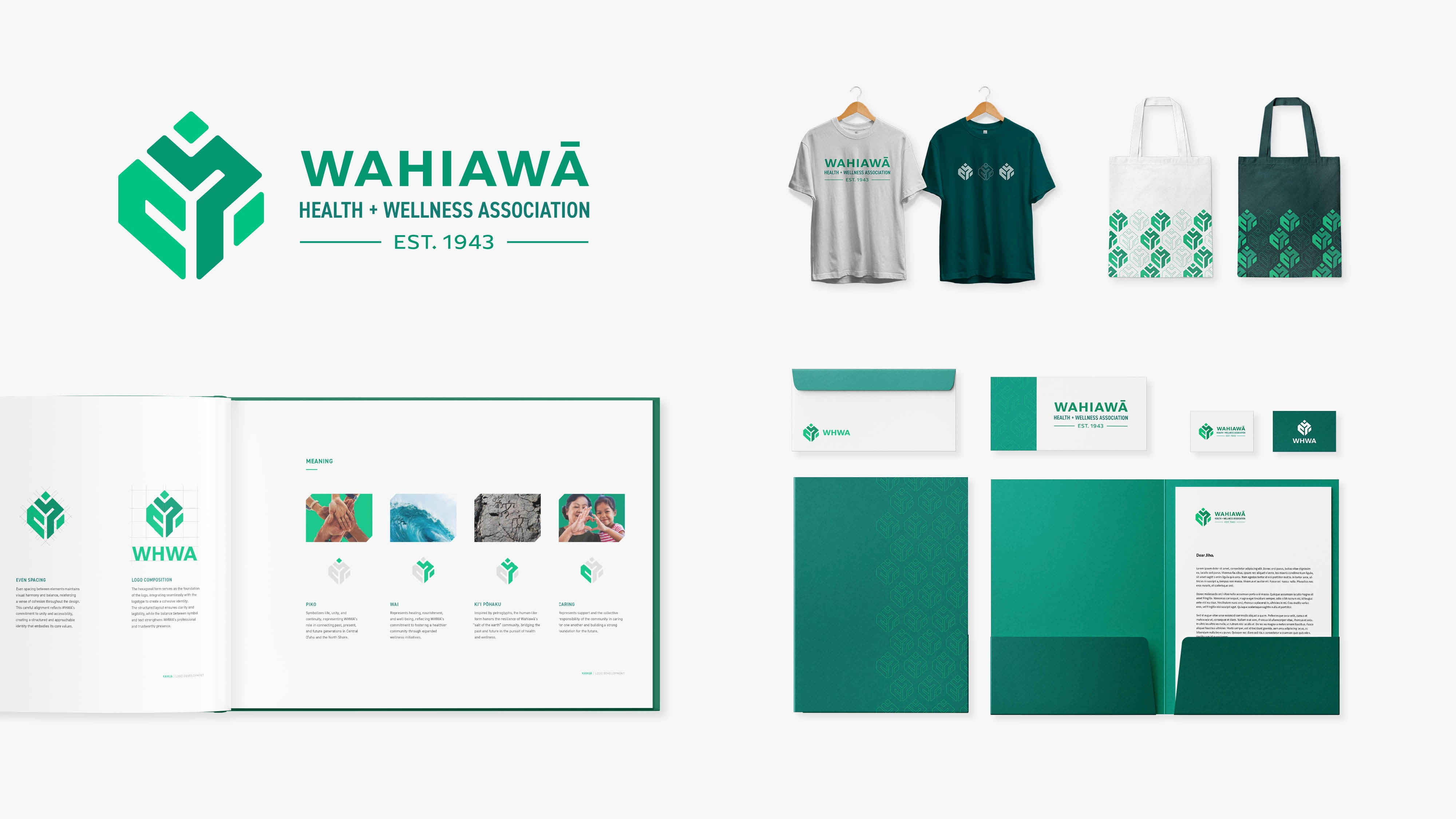
As the Wahiawā Health and Wellness Association (WHWA) transitioned from a hospital to a community-focused wellness organization, they sought a new identity that honors their legacy while supporting future growth.
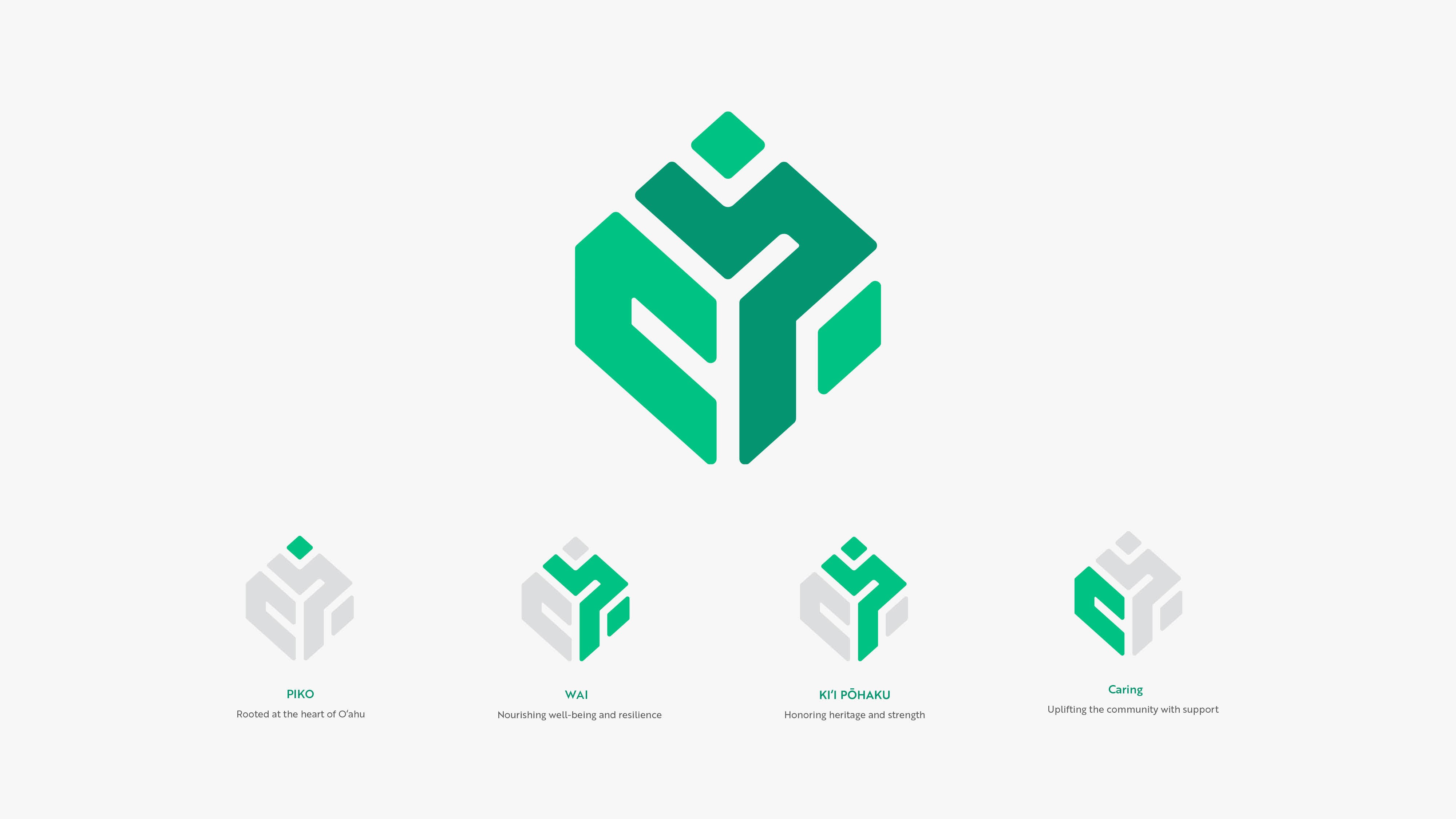
The new logo, titled Kahua (“Foundation”), reflects WHWA’s deep roots in the Central O‘ahu community and their ongoing commitment to health, sustainability, and cultural connection.
Tools: Illustrator, Photoshop, InDesign

Problem
Expanding the Mission: The shift from a direct healthcare provider to a broader wellness organization necessitated moving away from a traditional "hospital" image.
Deepening Community Ties: There was a challenge in maintaining historical ties to Wahiawā’s rural values while communicating a modern, accessible approach to health.
Solution
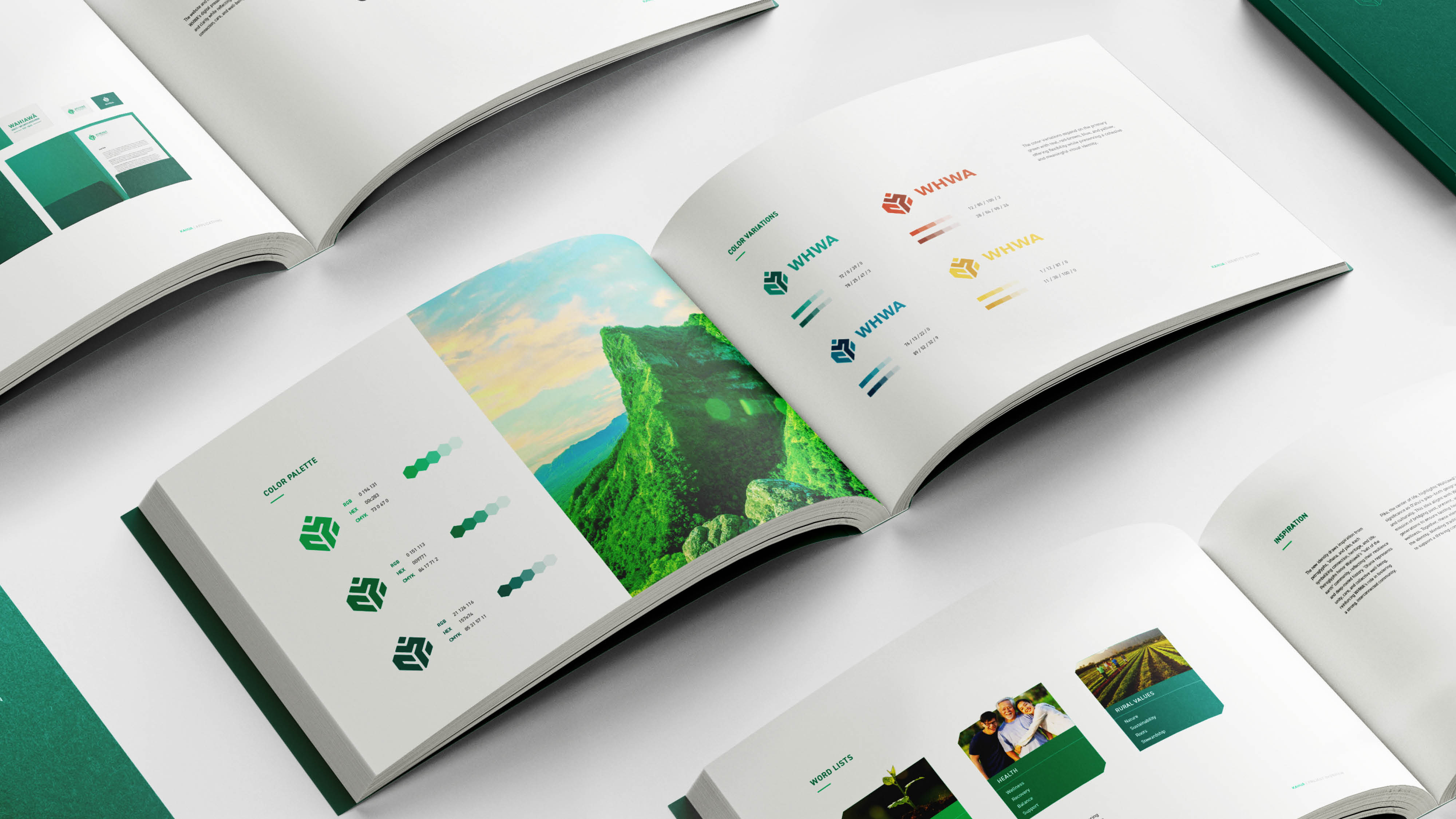
Mission-Driven Identity: I developed a new logo focused on connection, care, and community resilience. By maintaining a color palette similar to the original, I ensured the brand remained recognizable as it transitioned into its new role in holistic wellness.
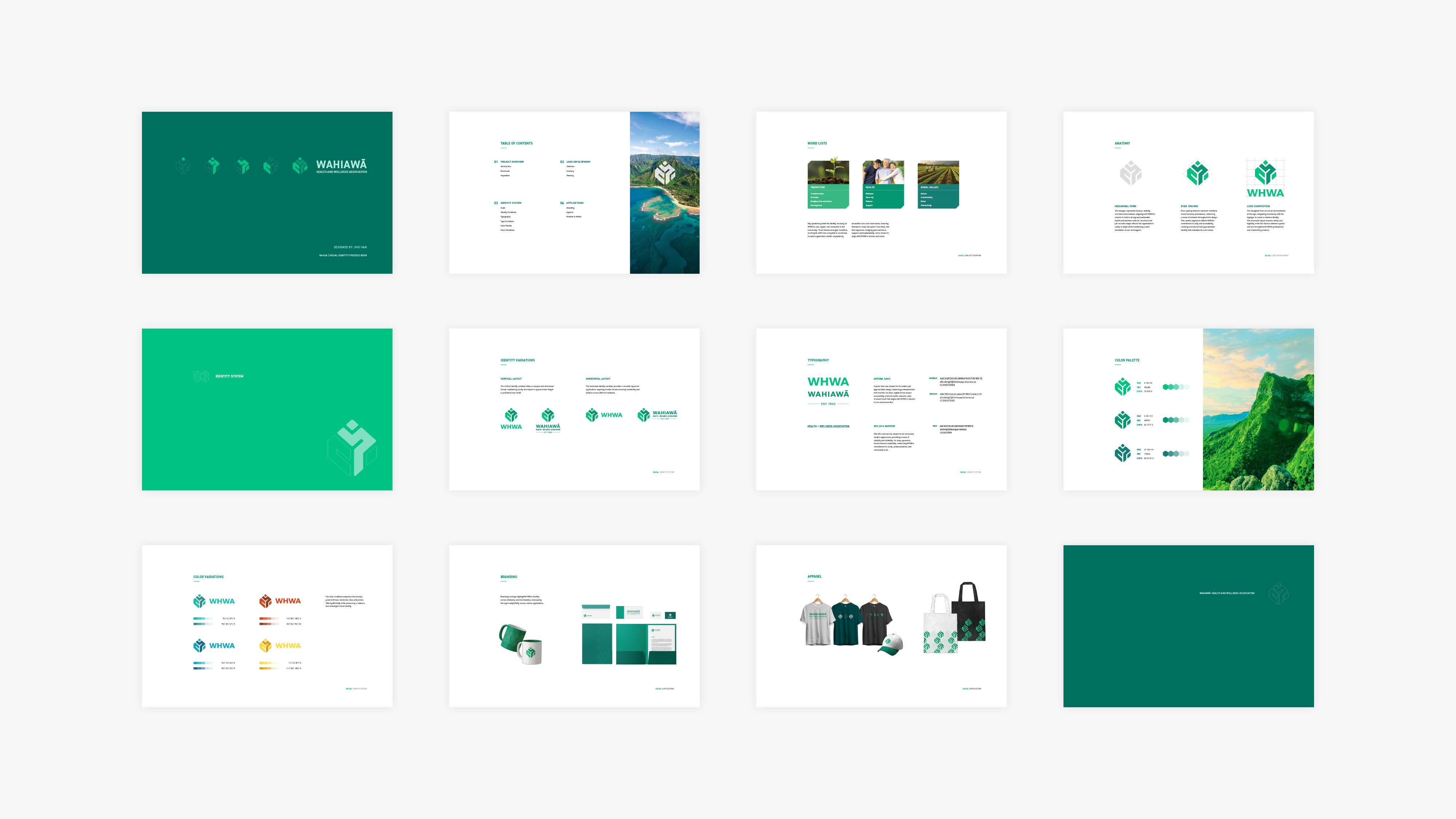
Systematic Branding: I broke down the logo into specific symbols to reflect the organization's purpose. I also created a comprehensive process book to document the design evolution and provide clear guidelines for the new identity.